Munsell color system

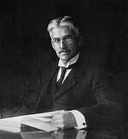
In colorimetry, the Munsell color system is a color space that specifies colors based on three color dimensions: hue, value (lightness), and chroma (color purity). It was created by Professor Albert H. Munsell in the first decade of the 20th century and adopted by the USDA as the official color system for soil research in the 1930s.
Several earlier color order systems had placed colors into a three dimensional color solid of one form or another, but Munsell was the first to separate hue, value, and chroma into perceptually uniform and independent dimensions, and was the first to systematically illustrate the colors in three dimensional space.[1] Munsell’s system, and particularly the later renotations, is based on rigorous measurements of human subjects’ visual responses to color, putting it on a firm experimental scientific basis. Because of this basis in human visual perception, Munsell’s system has outlasted its contemporary color models, and though it has been superseded for some uses by models such as CIELAB (L*a*b*) and CIECAM02, it is still in wide use today. [2]
Contents |
Explanation

The system consists of three independent dimensions which can be represented cylindrically in three dimensions as an irregular color solid: hue, measured by degrees around horizontal circles; chroma, measured radially outward from the neutral (gray) vertical axis; and value, measured vertically from 0 (black) to 10 (white). Munsell determined the spacing of colors along these dimensions by taking measurements of human visual responses. In each dimension, Munsell colors are as close to perceptually uniform as he could make them, which makes the resulting shape quite irregular. As Munsell explains:
Desire to fit a chosen contour, such as the pyramid, cone, cylinder or cube, coupled with a lack of proper tests, has led to many distorted statements of color relations, and it becomes evident, when physical measurement of pigment values and chromas is studied, that no regular contour will serve.—Albert H. Munsell, “A Pigment Color System and Notation”[3]
Hue
Each horizontal circle Munsell divided into five principal hues: Red, Yellow, Green, Blue, and Purple, along with 5 intermediate hues halfway between adjacent principal hues.[4] Each of these 10 steps is then broken into 10 sub-steps, so that 100 hues are given integer values. Two colors of equal value and chroma, on opposite sides of a hue circle, are complementary colors, and mix additively to the neutral gray of the same value. The diagram below shows 40 evenly-spaced Munsell hues, with complements vertically aligned.
| 5R |
|
5YR |
|
5Y |
|
5GY |
|
5G |
|
5BG |
|
||||||||||||||||||
|
201 130 134
|
201 130 127
|
201 131 118
|
200 133 109
|
197 135 100
|
193 137 94
|
187 140 86
|
181 143 79
|
173 146 75
|
167 149 72
|
160 151 73
|
151 154 78
|
141 156 85
|
127 159 98
|
115 160 110
|
101 162 124
|
92 163 134
|
87 163 141
|
82 163 148
|
78 163 154
|
73 163 162
|
|||
| 5BG |
|
5B |
|
5PB |
|
5P |
|
5RP |
|
5R |
|
||||||||||||||||||
|
73 163 162
|
70 162 170
|
70 161 177
|
73 160 184
|
82 158 189
|
93 156 193
|
104 154 195
|
117 151 197
|
128 149 198
|
141 145 198
|
152 142 196
|
160 140 193
|
168 138 189
|
177 135 182
|
183 134 176
|
188 132 169
|
193 131 160
|
196 130 153
|
198 130 146
|
200 130 140
|
201 130 134
|
|||
Value
Value, or lightness, varies vertically along the color solid, from black (value 0) at the bottom, to white (value 10) at the top.[5] Neutral grays lie along the vertical axis between black and white.
Several color solids before Munsell’s plotted luminosity from black on the bottom to white on the top, with a gray gradient between them, but these systems neglected to keep perceptual lightness constant across horizontal slices. Instead, they plotted fully-saturated yellow (light), and fully saturated blue and purple (dark) along the equator.
Chroma
Chroma, measured radially from the center of each slice, represents the “purity” of a color, with lower chroma being less pure (more washed out, as in pastels).[6] Note that there is no intrinsic upper limit to chroma. Different areas of the color space have different maximal chroma coordinates. For instance light yellow colors have considerably more potential chroma than light purples, due to the nature of the eye and the physics of color stimuli. This led to a wide range of possible chroma levels—up to the high 30s for some hue–value combinations (though it is difficult or impossible to make physical objects in colors of such high chromas, and they cannot be reproduced on current computer displays). Vivid soil colors are in the range of approximately 8.
|
Note that the Munsell Book of Color contains more color samples than this chart for both 5PB and 5Y (particularly bright yellows, up to 5Y 8.5/14), however they are not reproducible in the sRGB color space, which has a limited color gamut designed to match that of televisions and computer displays. Note also that there are no samples for values 0 (pure black) and 10 (pure white), which are theoretical limits not reachable in pigment, and no printed samples of value 1. |
||||||||||||||||||||||||||||||||||||||||||||||||||||||||||||||||||||||||||||||||||||||||||||||||||||||||||||||||||||||||||||||||||||||||||||||||||||||||||||||||||||||||
Specifying a color
5P 5/10
A color is fully specified by listing the three numbers for hue, value, and chroma. For instance, a fairly saturated purple of medium lightness would be 5P 5/10 with 5P meaning the color in the middle of the purple hue band, 5/ meaning medium lightness, and a chroma of 10 (see the swatch to the right).
History and influence


The idea of using a three-dimensional color solid to represent all colors was developed during the 18th and 19th centuries. Several different shapes for such a solid were proposed, including: a double triangular pyramid by Tobias Mayer in 1758, a single triangular pyramid by Johann Heinrich Lambert in 1772, a sphere by Philipp Otto Runge in 1810, a hemisphere by Michel Eugène Chevreul in 1839, a cone by Hermann von Helmholtz in 1860, a tilted cube by William Benson in 1868, and a slanted double cone by August Kirschmann in 1895.[7] These systems became progressively more sophisticated, with Kirschmann’s even recognizing the difference in value between bright colors of different hues. But all of them remained either purely theoretical or encountered practical problems in accommodating all colors. Furthermore, none was based on any rigorous scientific measurement of human vision; before Munsell, the relationship between hue, value, and chroma was not understood.[7]
Professor Munsell, an artist, wanted to create a “rational way to describe color” that would use decimal notation instead of color names (which he felt were “foolish” and “misleading”)[8], which he could use to teach his students about color. He first started work on the system in 1898 and published it in full form in A Color Notation in 1905.
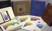
The original embodiment of the system (the 1905 Atlas) had some deficiencies as a physical representation of the theoretical system. These were improved significantly in the 1929 Munsell Book of Color and through an extensive series of experiments carried out by the Optical Society of America in the 1940s resulting in the notations (sample definitions) for the modern Munsell Book of Color. Though several replacements for the Munsell system have been invented, building on Munsell’s foundational ideas—including the Optical Society of America’s Uniform Color Scales, and the International Commission on Illumination’s CIELAB (L*a*b*) and CIECAM02 color models—the Munsell system is still widely used, by, among others, ANSI to define skin and hair colors for forensic pathology, the USGS for matching soil colors, in Prosthodontics during the selection of shades for dental restorations, and breweries for matching beer colors.[9][10]
Notes
- ↑ Kuehni (2002), p 21
- ↑ Landa (2005), pp 437–438,
- ↑ Munsell (1912), pp 239
- ↑ Cleland (1921), Ch. 1
- ↑ Cleland (1921), Ch. 2
- ↑ Cleland (1921), Ch. 3
- ↑ 7.0 7.1 Kuenhi (2002), pp 20–21
- ↑ (Munsell 1905), ch.1, pg. 7
- ↑ MacEvoy (2005)
- ↑ Landa (2005), pp 442–443. Beer color is measured in Degrees Lovibond, a metric based on the Munsell system
Bibliography


- Cleland, Thomas M. (1921). A practical description of the Munsell color system, with suggestions for its use. Boston: Munsell Color Company. One of the first books about the Munsell color system, explaining the intuition behind its three dimensions, and suggesting possible uses of the system in picking color combinations. An edited version can be found at http://www.applepainter.com/.
- Kuehni, Rolf G. (February 2002). "The early development of the Munsell system". Color Research and Application 27 (1): 20–27. doi:10.1002/col.10002. A description of color systems leading up to Munsell’s, and a biographical explanation of Munsell’s changing ideas about color and development of his color solid, leading up to the publication of A Color Notation in 1905.
- Landa, Edward R.; Mark D. Fairchild (September-October 2005). "Charting Color from the Eye of the Beholder". American Scientist 93 (5): 436–443. doi:10.1511/2005.5.436. http://www.americanscientist.org/template/AssetDetail/assetid/45931/page/1;jsessionid=aaa5LVF0. An introductory explanation of the development and influence of the Munsell system.
- MacEvoy, Bruce (2005-08-01). "Modern Color Models – Munsell Color System". Color Vision. http://www.handprint.com/HP/WCL/color7.html#MUNSELL. Retrieved 2007-04-16. A concise introduction to the Munsell color system, on a web page which also discusses several other color systems, putting the Munsell system in its historical context.
- Munsell, Albert H. (1905). A Color Notation. Boston: G. H. Ellis Co.. http://books.google.com/?id=PgcCAAAAYAAJ Munsell’s original description of his system. A Color Notation was published before he had established the irregular shape of a perceptual color solid, so it describes colors positioned in a sphere.
- Munsell, Albert H. (January 1912). "A Pigment Color System and Notation". The American Journal of Psychology (University of Illinois Press) 23 (2): 236–244. doi:10.2307/1412843. http://books.google.com/?id=FdQLAAAAIAAJ&pg=PA236. Munsell’s description of his color system, from a lecture to the American Psychological Association.
- Nickerson, Dorothy (1976). "History of the Munsell color system, company, and foundation". Color Research and Application 1 (1): 7–10. http://www3.interscience.wiley.com/cgi-bin/jissue/114188682.
External links
- Munsell Color Products, from X-Rite, current owners of the Munsell Color Company.
- Munsell to L*a*b* Conversion Freeware, a Windows application for converting Munsell renotations to CIELAB coordinates.
- Munsell Color Science Laboratory at the Rochester Institute of Technology, an academic laboratory dedicated to color science, endowed by the Munsell Foundation.
- Munsell renotation data in plain text format (from the 1940s Optical Society of America renotations).
- ApplePainter.com, a site explaining the Munsell color chart, including an edited version of Cleland’s book, A practical description of the Munsell color system.
- An explanation of the Munsell system at Adobe.com. Retrieved 13 August 2003
- A brief explanation at the site of the Japanese company Dainichiseika Color & Chemicals, including a nice diagram of the Munsell color solid.
- A flash-based Munsell Palette color-picker from web-design firm Triplecode (based on a version originally created at the MIT Media Lab).
|
||||||||||||||||||||